The iPhone Competition? Still Not So Much …
Are we getting a repeat of the iPod?
There it is – a big target as big as daylight – right by the broad side of the barn … yet, after 6 years, you still get comments & reviews of competiting products that offer faint praise such as …
“Slightly more expensive than the iPod,”
“Slightly wider & heaver than the iPod,”
“Screen goes dark after 20 seconds …”
Etc, etc … competition, yes – good competition, no.
People “complain” that the iPod is just an assemblage of off-the-shelf parts and yet, why doesn’t anyone else get it? ESpecially when you compare the latest iPods to your uh, second best choices.
It’s starting to repeat on the cell phone side. I have not actually used these phones but judging from the photos, it’s clear they still don’t get it – that it’s MORE than just an assemblage of parts and features – that the checklist way of doing business is not much of a business – for lazy engineers and marketers, yes – consumers, no.
LG?
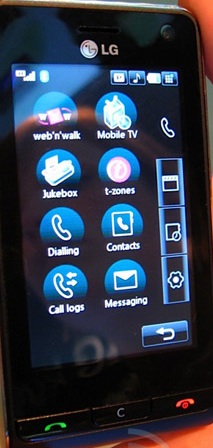
If this is a color screen, what are you saving the color pixels for? This is about the least amount of color you could use and still call it color.
It seems to have escaped most designers – especially of cell phones designers – that ICONS are useful when they replace or stand in place of words but when you have an icon that means nothing to anyone you stop on the street, you have defeated your purpose and have designed not only nothing but nothing + negative is worse.
Also, why are some icons “3-D” and others are flat? That is just visually confusing.
Why are there THREE “phone” icons?? A phone drawing on an address book like icon is fine but paired with another phone icon and a phone icon with arrows just confuses people.
What is Web ‘n Walk – is it the internet? Is it hotspot out of home wifi? It’s all just visual pollution at this point, and it’s semi 2D-ish … so the troika of confusion is complete with 1D, 2D & 3D icons.
Shouldn’t the PHONE icon be on top?
Now, you can argue that your phone log should be a top level choice versus Apple’s sub-choice but who here thinks a phone icon with arrows indicates call log? Anyone? Anyone?
Then why are some icons in a rectangle form on the right? I guess it means “phone mode” but what’s that underneath? A web browser? But the FIRST button is WEB ‘N WALK so one browser is for when you are seated and another browser is for when you are walking around? I’m presuming the third rectangle icon is messaging/voicemail – so why is that not in the “phone mode” section but mobile TV is?
Look, we know there are some features that just escape a clean icon everyone can understand like SETTINGS but for instance, Apple put nearly every setting there and labeled it – so sometimes words are better than just an icon but then don’t confuse people with idiotic market-speak words like web ‘n walk when you mean Internet.
(photo lifted from Engadget)
Motorola
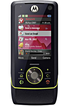
I hope I can activate the fireworks screensaver because there is just not enough visual stuff on the screen … is MS Clippy still alive so he can dance in from the side also?
Maybe they figure since we’ll watch ESPN news and CNN with scrolling bars, sidebar elements and popup screen, hey, why not replicate the feeling on a tiny screen.
Of course, I’m not sure why RINGTONE and SEND AN EMAIL are on the same screen PLUS the scary “MORE” at the bottom because we like to put all 15 cryptic menus on the same screen.
Um, where is the keypad? Guess it’s on a touchscreen? WE will mock it to death on an iPhone but once we add it, it’s leading edge technology?
Nokia
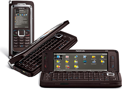
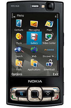
Two new phones from Nokia that continue along the path of icons for the sake of icons.
Did they decide, well if LG takes, every possible dimension of an icon design, we’ll take, Nokia – our icons can every possible shape possible to detract visually as possible? Rounded, beveled, square – some with drops shadows, others without, some pointing rigth, others up and still others carved-in?
There is one consistent constant – fugly.
It’s rare to see icons uglier than Win ’98 icons still being used – not only are they ugly but they only serve to reinforce that your product is 10 years old the day it comes out.
Smart thing for an $800 product?
(oh yea, more expensive than the iPhone but that’s okay, only an iPhone is expensive at $599, anything else at $800, it’s an “iPhone killer.”)
Maybe Nokia just didn’t go back far enough – how about the warm & fuzzy 1970’s?



Again, let’s talk big but design and ship small.
Marketing & consumers want icons – we’ll just grab some free creative commons ones and call it a day. We have a touchscreen (well, only three points on the screen) and icons are icons, who could misconstrue the meaning of a 2D folder along with two 3D beveled squares?
They are still letting the manufacturing and engineer arm of the company make all the decisions and that won’t cut it anymore.
It’s clear that the design interface of cell phones have not advanced much from the 1980’s to 2007. Apple’s iPhone took a huge leap forward – it’s not perfect by any means but at least it’s the first 4-wheel car while others are wobbling about on 3-wheels. So instead of applying the 15-20 YEARS of experience and know how that Nokia, LG, Samsung & Moto should have picked up somewhere along the way and make theirs BETTER than the iPhone, their feverent response to the iPhone?
In essence, they’ve attached the 4th wheel to the hood, to the roof and underneath on the still 3-wheeled cell phone … they still don’t get it.
So whether it’s $399 or $599 … well, maybe next year, the iPhone will get some complete competition. By then, they’ll only be 10 million smartphones behind.
* Yes, the Blackberry has better corporate email and as long as your company is paying for it, it’s fine for email but for everything else? Three wheels.
| « “Cheaper iTunes Just to Sell More iPods,” … And Cheaper DVD’s Sell More Tractors? | Best Burger Ever! » |


