First Look At Beta of Flash-Based Word Processor, Buzzword
Buzzword is the name of the Flash based word processor in beta by the company, Virtual Ubiquity. While being fully acknowledged as a work in progress in the beta stage, I am one of the lucky beta-nauts testing the app out and my first thoughts are 4 out of 5 robots (hey, we had to have some sort of ranking tool on this blog). UDPATE: Adobe has signed a definitive agreement to purchase Virtual Ubiquity and Buzzword. Look for news out of the Adobe MAX conference later today.
The main intro screen looks like this:
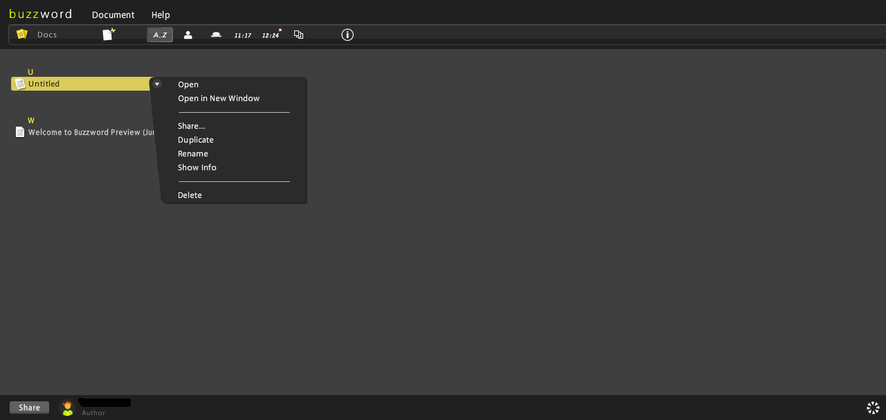
We selected our untitled test page, which now looks like this:
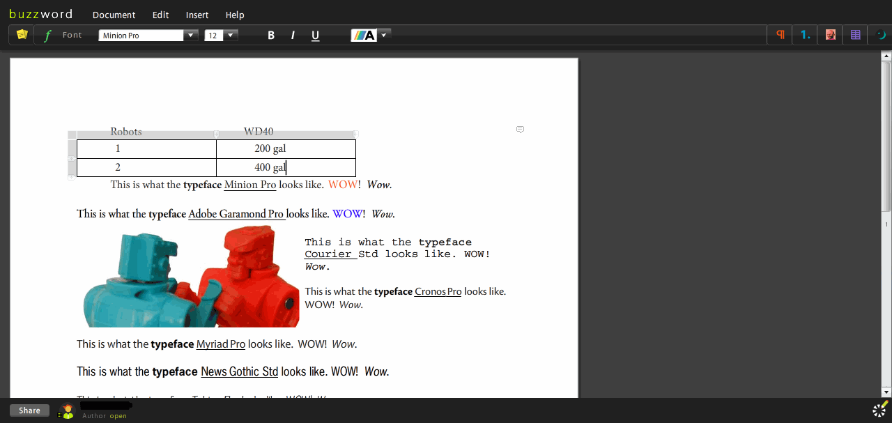
Notice that the top tool bar now reveals the font selection menus. These can be clicked/rolled over on to bring up the pull down options (very nice) to reveal options you wish for the font in question. The image above shows all of the fonts loaded into the beta which granted are not much but in beta you don’t really need to have your funky Klingon, Papyrus, or Comic Sans fonts installed.

Above is a snapshot of just the toolbar header with the Paragraph options revealed. So far, you can select flush left, centered, flush right as well as options for line spacing and spacing above / below, and indenting a line of text. Ctrl-Z works just fine for you keyboard jockeys like me out there as does many of the standard shortcuts you are probably familiar with in that other word processing program.

Above is the next menu item, Lists which allows for bulleting using ‘dots’ or numbers. Rolling over one of these options brings up another sub menu for numbering style, outline level, skip a line (very handy) and continuing a list. Below you will see the menu bar for the bulleting options icons that appear:

The other menu options are for inserting images (much like our robots in the above test image) and tables which are very quickly created such as this:
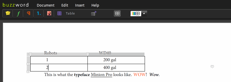
You can see that two robots consume a lot of WD40. Our minions require lots of fuel.
One of the more fun aspects of this application is how the color section menu appears which looks like this:
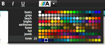 Pretty nice choices for a beta launch I think however there should be a customization option I think here so I hope this is being added down the road. Too often you need just that right color or shade to make that letter / presentation POP!
The last toolbar menu available in beta is the ruler which can really help keep errant text items in line:

Even just playing around with the interface in beta mode I have to say, hands down, that this app is killer. And the gurus at Virtual Ubiquity are not even close to being done with this beast yet.
Here’s what’s planned on their fall release:
- clipboard support for images
- import/export for Word, ODF, HTML, RTF
- print to PDF
- spell check
- document versioning
- multiple editors sharing a document at the same time
- endnotes
- comment printing
- word count
Rating a beta version of an application so highly out of the gate (4 out of 5 robots) can bite you in the buttocks but it appears to be a safe call at this stage. The company is located in Beantown rather than Silicon Valley which is a nice change of pace. You east coasters out there gotta love that.
Stay tuned here at 2aday for more updates on this new app.

